“I love your site, but it’s sluggish. I didn’t make it to the end.”
That’s the comment that comes up most often about visually ambitious sites. It’s also the one that makes people think they have to choose between a beautiful site and a fast site.
Good news: if you’re reading this before launching your redesign, you’re catching it at just the right time.
What’s really at stake
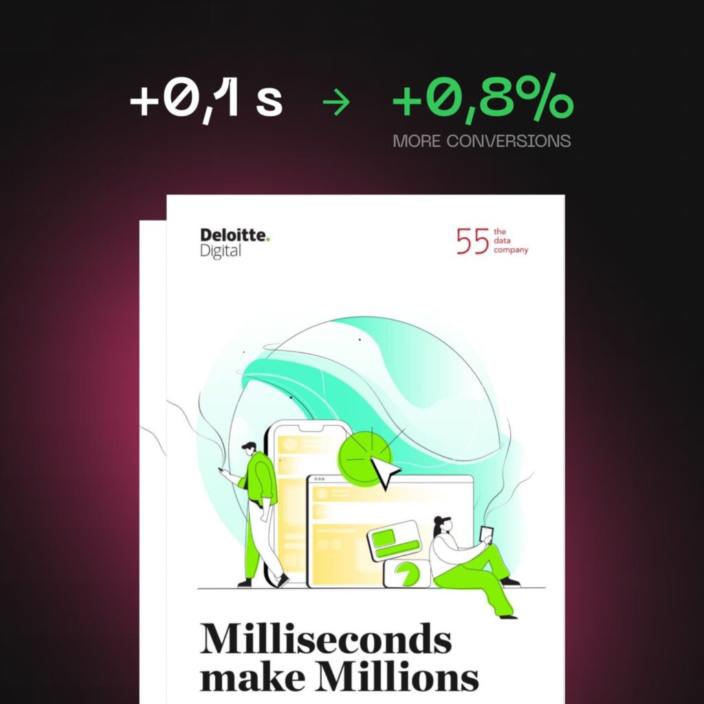
The Milliseconds Make Millions study, commissioned by Google and conducted in 2020 by Deloitte Digital and fifty-five, tracked 37 European and American brands across more than 30 million sessions, with no interface redesign during the period. When four mobile speed metrics each improved by 0.1 seconds, conversions rose by 8.4% in retail and 10.1% in travel. In luxury, access to contact pages climbed by 20.6%.
One tenth of a second. That’s the scale we’re talking about.
So performance isn’t a technical requirement. It’s the return on the investment you’re about to make.
How do you measure your site’s performance?
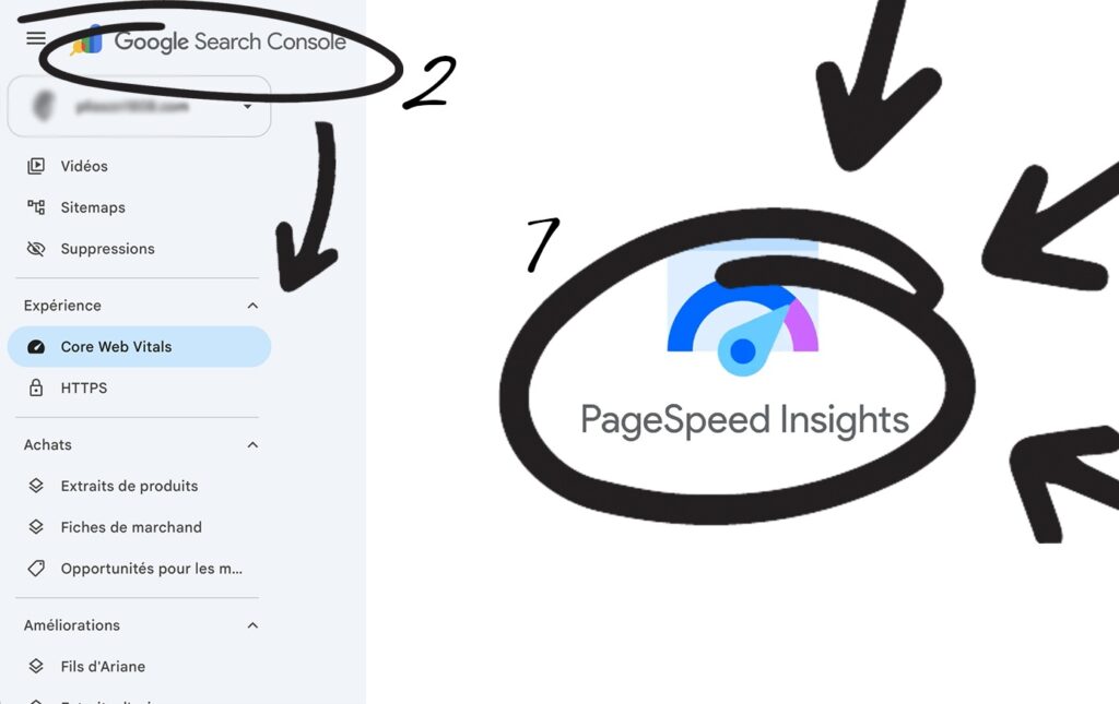
Two places, both free.
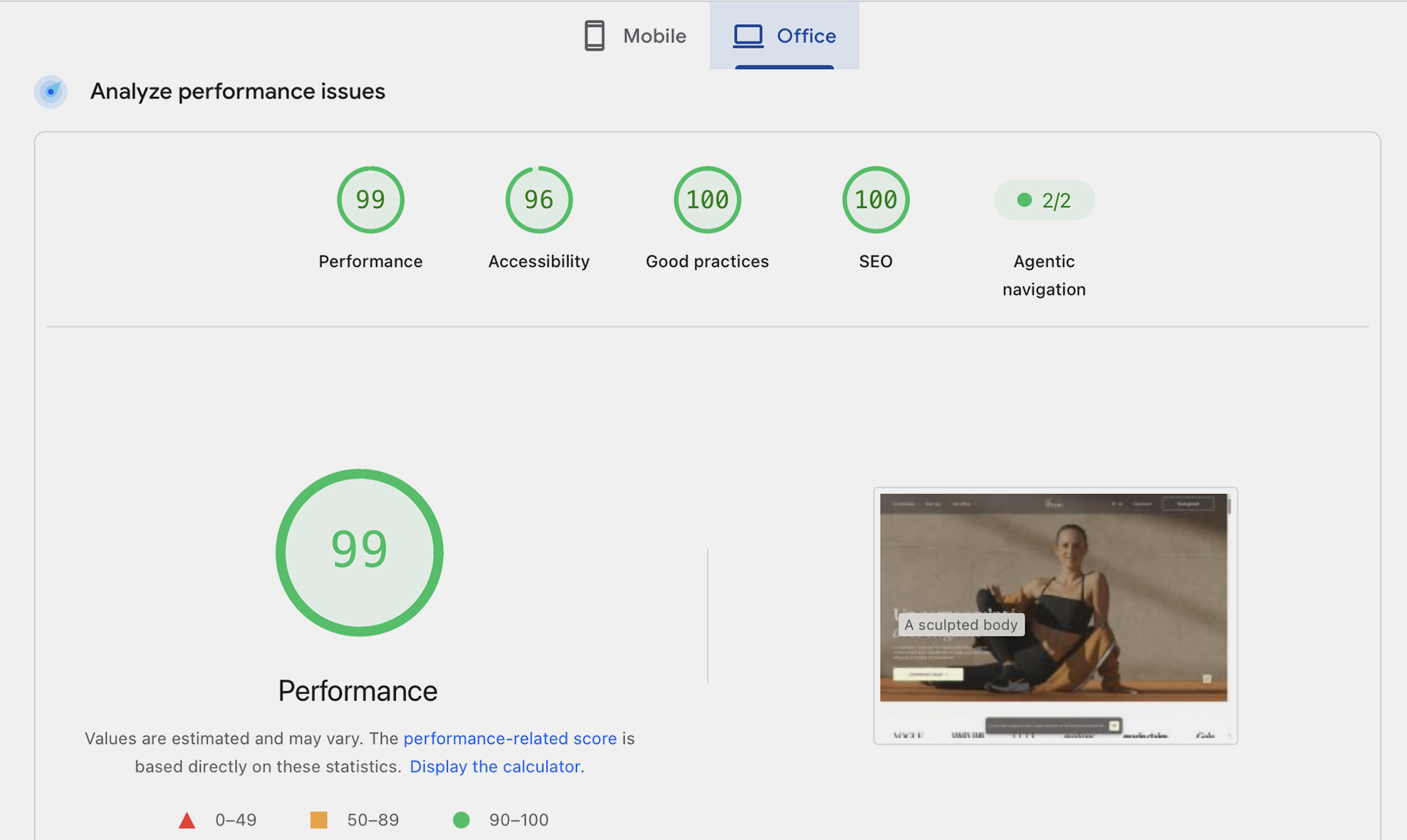
PageSpeed Insights (pagespeed.web.dev): you enter a URL and get a report. Careful, though – it contains two very different things. At the top, field data: real measurements collected from your Chrome visitors over the last 28 days. Below that, the big score out of 100: a simulation, run on a deliberately modest mobile device and a throttled connection.
Only the first block matters for your SEO. The second is the one everyone looks at and comments on.
One thing to know: if your site is new or gets modest traffic, the field data panel may be missing – Google hasn’t gathered enough real measurements yet. In that case all you have left is the simulation, and it’s worth reading with that caveat in mind.
Google Search Console, “Core Web Vitals” report: it tells you how many of your pages are affected, and which ones. This is where you set your priorities. Worth noting: Google doesn’t evaluate the average of your visitors, but the 75th percentile of them. So a site that’s fast “in general” can still be flagged as slow.
The tools name each metric and show the threshold to hit – no need to memorize them. What matters is understanding what they describe: the time before the main content appears, how quickly the page responds to a click, and how much the layout shifts around during loading.
Google score vs. real-world performance: two different measures
Here’s the nuance that’s missing from almost every article on this topic: there’s the performance that Google measures, and the one your visitor actually experiences.
The two often overlap. Not always.
Google’s version follows precise, published rules, and that’s a good thing – you know exactly where you stand. But it measures delays without ever knowing why they’re there. Lived performance, on the other hand, depends on things no score captures. Could the visitor start reading right away? Does scrolling feel smooth? Did they find what they came for without effort?
The clearest example is an intentional loading sequence at the entrance of a site. Designed as a pause that eases the visitor in, it’s part of the experience. For PageSpeed, it’s a display delay, and you lose points. Both readings are valid: the gesture makes sense, and it genuinely delays access to the content. So it’s a choice to make with your eyes open, not an effect to add without thinking about it.
So why play Google’s game at all? Because Google is the one deciding whether to show you or not. You can’t ignore its criteria – they determine your visibility. But you can’t follow them blindly either, or you risk delivering a site that pleases a measurement tool while disappointing its visitors.
Two habits follow from this. Never draw conclusions from a single reading: scores vary from one test to another, sometimes by several points on the same page. Only the trend over several weeks means anything. And cross-check tools: GTmetrix, WebPageTest, or Chrome’s Performance tab let you choose the device, connection, and test location, and will give you different numbers. None of them is right on its own.
The seconds aren’t hiding in the design. They’re hiding in the integration.
Here’s what almost no one says clearly: two teams can build the exact same design and ship two different sites – one loading in 1.2 seconds, the other in 5. Same visuals, same animations, same content. The entire difference happens in the invisible work between design approval and launch.
None of what follows is something you need to think about yourself. It’s your agency’s job. But it’s worth knowing, because it all happens at moments when you’re not in the room.
1. Images – almost always the first culprit. A 4MB photo displayed in a 600-pixel block, served as-is: the browser downloads everything, then resizes it. The visitor waits. Properly processed, that same photo weighs a fraction of that with no visible difference. Modern formats, several sizes generated automatically, lazy loading below the fold, dimensions declared so nothing jumps around. It’s the most cost-effective lever on the web, and the most commonly neglected – because it doesn’t show.
2. Typography – your text should never have to wait. A distinctive typeface does a lot for a brand, and there’s no reason to give it up. Poorly implemented, it produces one of two effects visitors hate: a blank space while the font arrives, or text that jumps when the real font replaces the fallback. Preload the files, choose a fallback font with similar proportions, display the text immediately. Your typography stays intact, and the visitor reads right away.
3. Animation – the same effect can cost two seconds or zero. If the code driving animations runs before the first paint, it blocks everything: the visitor stares at a blank screen while the browser prepares effects they can’t see yet. Loaded afterward, the page appears immediately and the experience sets up behind the scenes. Same design, same animation, two seconds apart. It’s an integration choice, not a design choice.
4. Page transitions – the trickiest effect. You click, and instead of a jarring reload, the next page slides in as a continuation of the previous one. It feels like an app. It’s also one of the hardest effects to get right: done poorly, it creates a dead moment where the visitor doesn’t know if their click registered.
5. Third-party scripts and hosting. Analytics, tag managers, consent banners, heatmap tools: each seems harmless, but their sum isn’t – and since they come from servers you don’t control, their slowness becomes yours. Finally, before the browser does any work at all, it waits for your server to respond. Entry-level hosting can eat up several hundred milliseconds of that, and no amount of image optimization will make up for it.
If your provider brings these things up without being asked, that’s a good sign. And if they measure from the very first integrated page rather than at final delivery, even better: a problem caught early gets fixed; the same problem discovered at delivery gets renegotiated.

The Ronnsquare case
We applied this approach to ronnsquare.fr, the site of Ronnsquare, a workspace architecture and design specialist.
A demanding project from this angle. When your business is designing spaces, photographs of your work are your best sales pitch – degrading them to gain a few points on a score was never an option. Two other requirements carried a lot of weight: complex animations, and perfectly smooth transitions between pages. Those are what give the site its sense of continuity, and they’re precisely the hardest things to achieve without slowing down the display.
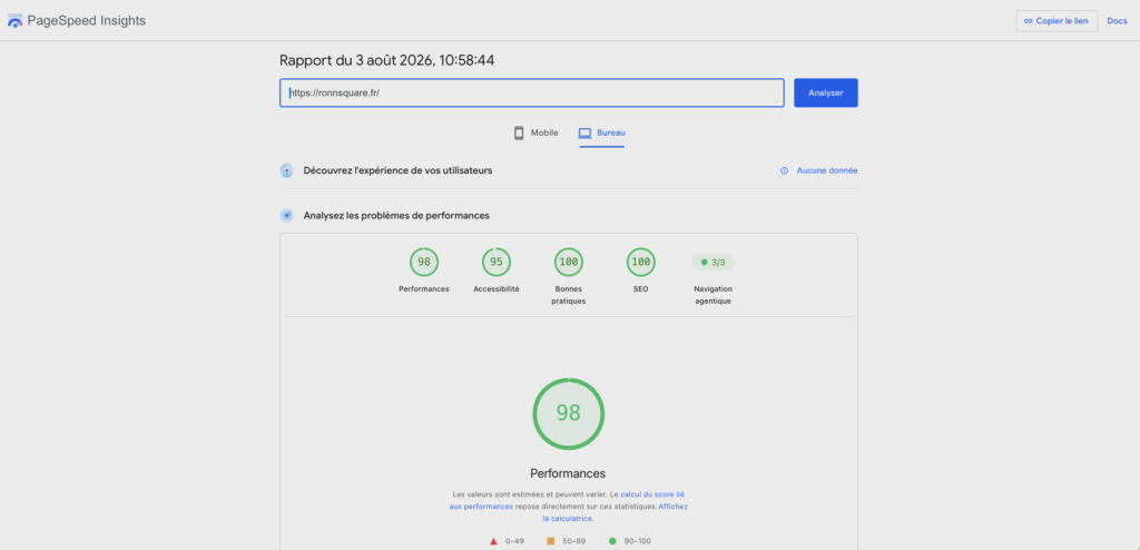
One measured result deserves to stand on its own, because it’s exactly what this kind of site usually loses: a Cumulative Layout Shift of 0 on mobile, measured on August 3, 2026, on a site full of page transitions and complex animations. Nothing shifts while the page builds. No heading jumping under the cursor, no button slipping away from the finger aiming at it. On a site built around animation and page transitions, that number is the exception rather than the rule – and it’s the entire difference between movement that’s been designed and movement that’s been bolted on.
The performance work doesn’t stop at delivery, either. We keep measuring after launch, because a site evolves – pages get added, content grows – and the numbers move with it.
At Colibrity, performance isn’t a subject you open at delivery. It’s a criterion set at the start of the project and kept in mind throughout production – including, and especially, on the most immersive sites. That’s exactly where you can never let it go.
In summary
A beautiful site that’s slow is almost never the result of a design that’s too ambitious. It’s the result of an integration that never established what needs to appear immediately and what can come afterward.
You don’t have to give up your video, your typography, or your animations. You just need them placed in the right order – and a score read as an indicator, not as a command.
Frequently asked questions
Is an animated site necessarily slow?
No. The same animation can cost two seconds or nothing at all, depending on when its code runs. If the animation scripts load before the first paint, the visitor waits in front of a blank screen; loaded afterward, the page appears immediately. It’s an integration choice, not a consequence of the design.
How do I know if my site is slow?
Open PageSpeed Insights and read the top panel, which shows real measurements from your Chrome visitors over 28 days – not the score out of 100, which is a simulation. Complement this with Search Console’s Core Web Vitals report, which shows how many of your pages are affected. And test the site on your own phone, on mobile data, away from the office wifi.
What exactly does Google measure?
Three signals:
- the time before the main content appears,
- how quickly the page responds to a click,
- the extent of layout shifts during loading. Google doesn’t evaluate the average of your visitors but the 75th percentile of them, which is why a site that’s fast “in general” can still get flagged as slow.
Should I give up visual effects to gain points?
Not necessarily, but some effects genuinely cost points. A loading sequence at the entrance of a site makes sense for the brand, and it does delay access to the content: both readings are valid. What matters is that it’s a decision made with full awareness, not an effect inherited by default.
Worth Knowing
We are a French digital agency specializing in creating custom websites that drive conversions and in data management.
And much more.
Contact Us – Response within 48 hours