No website goes obsolete on a schedule. But there’s a reason the rule keeps circulating.
A website costs money every year: maintenance, licenses, hosting, your team’s time. That cost climbs as the platform ages, because every change takes more effort than the last. At some point, keeping the site costs more than rebuilding it. That point usually lands somewhere between year three and year five. Hence the rule.
But it’s an average, not a diagnosis. Some sites run comfortably for seven years. Others need rebuilding after eighteen months.
If you’re defending a budget internally, the age of the site is a weak argument. Three things, on the other hand, build a solid case: the annual cost of the platform, the list of things it stops you from doing, and the risk it puts on the business.
The eight signals below are the ones that genuinely justify the decision. They apply to a brand site as much as to an online store. Each one ends with how to check it yourself.
1. A tenth of a second is worth 8% of your conversions
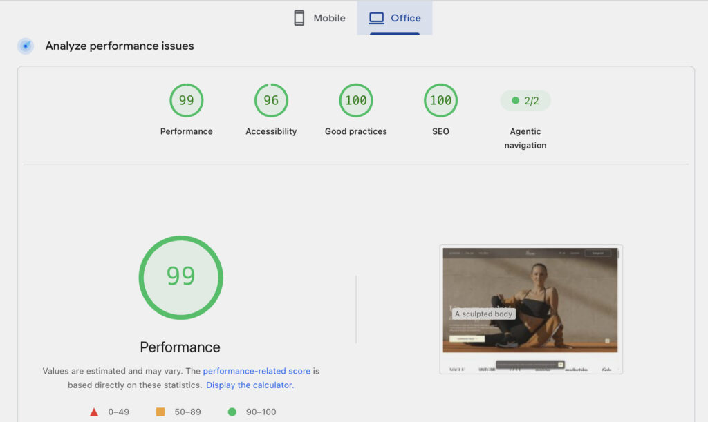
Deloitte’s study for Google, covering 37 brands and 30 million mobile sessions: shave 0.1 seconds and you gain 8.4% more conversions in retail, 10.1% in travel. Your site, meanwhile, hasn’t gained a tenth of a second since launch. It has lost several – one analytics tag and one cookie banner at a time.
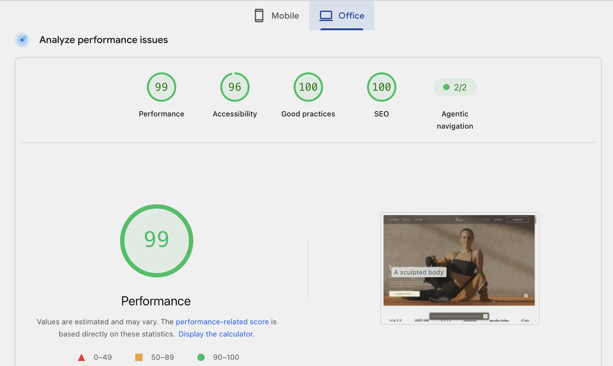
Those seconds show up in your Core Web Vitals – Largest Contentful Paint for how fast the main content renders, Cumulative Layout Shift for how much the page jumps while it loads. Neither of them is hiding in the design. Two teams building from the same mockups can ship one site at 1.2 seconds and another at 5: it all comes down to how images are processed, how fonts load, and when animation code actually runs read more. Two of our projects make the point by measurement. On Ronnsquare, an architecture practice, despite complex animations and page-to-page transitions: zero layout shift on mobile. On The Studio by Julie Granger, despite video, animation and an integrated store: 1.5-second load time and a 97% performance score.
How to check this yourself: PageSpeed Insights, three pages, mobile. Read the top panel – your actual visitors, the field data – not the score out of 100. Past 2.5 seconds on Largest Contentful Paint, or above 0.1 on Cumulative Layout Shift, you’re outside Google’s thresholds.

2. Keeping your site costs more than rebuilding it
Most teams underestimate their website maintenance cost, because it arrives in five or six separate lines. Add up twelve months: maintenance, subscriptions, hosting, the commissions third-party tools take on every transaction, and internal hours spent working around what the site can’t do. Those last two lines are the most expensive and the easiest to put a number on.
On our redesign for The Studio by Julie Granger, bringing ticketing directly into the site removed a 3% commission on every booking. And at Le Coin des Barons, a client we’ve supported since day one, partial data flowing into the CRM was costing two to three hours of manual entry a week: 100 to 150 hours a year spent retyping data.
Another symptom: when your teams start building pages outside the main site, you’re already paying for a redesign in fragments – without getting any of the benefit.
How to check this yourself: compare that annual total against the price of a new build. Past a third, the decision has already been made for you.
3. Mobile or desktop: your site never actually chose
The standard advice – “go mobile-first” – is too broad to make a decision with. The right call depends on your sector, and it comes out of your own data.
Two of our projects sit at opposite ends. DriveBerry, an automotive startup, speaks to an audience that browses mostly from a phone. So we designed a deliberately simplified mobile version with a reduced level of animation: on a small screen, motion should aid comprehension and guide the journey rather than demonstrate craft. Result: under 2 seconds to load, animations included. At the other end, United Kitchens sells to professionals working from a desk: the design effort goes to the large screen, where the actual selection work happens.
A site designed on desktop mockups and then “made responsive” made neither of those calls. It was compressed, not designed: columns stacked, menus folded away, animations left exactly as they were – and they cost the most precisely where the device and the connection are weakest.
How to check this yourself: in your analytics, pull traffic share and conversion rate by device over 90 days. If mobile converts half as well while making up half your visits, that gap is a design problem, not a visitor-behavior problem.
4. Publishing a page takes three weeks
Marketing depends on IT, IT weighs the site against heavier priorities, and campaigns go live without a proper landing page. Once a content change takes more than two or three weeks, it isn’t a workload issue: the site has no reusable components, so every page requires development.
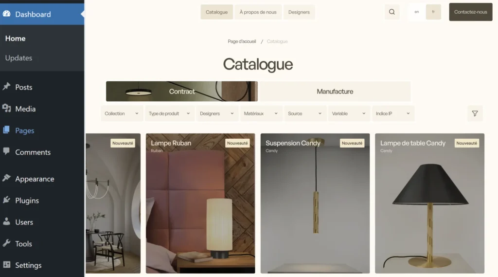
The bottleneck isn’t always technical. It’s often the admin interface. At CVL Luminaires, a high-end lighting manufacturer with more than 60 years behind it, the catalog lived across two separate sites – so, two admin interfaces. Two places to search, two places to update, and no consolidated view of the business. We merged them into a single site. When your team has to stop and think about *where* to change a piece of information, the cause is structural and the delay is just the symptom.
If you sell online: how long does it take to launch a promotion of a type the platform didn’t anticipate? If the answer is “we’d have to build it,” your tech stack is setting your commercial speed.
How to check this yourself: the average turnaround on your last ten content change requests.
5. Your best offers are three clicks deep
Compare your ten most-visited pages with your ten most profitable offers. If those two lists don’t overlap, your site is working for something other than your margin – and that isn’t fixable page by page without damaging your rankings.
The classic case is offers that don’t fit the platform’s mold. When we took over the site for The Studio by Julie Granger, the brand was selling one-to-one sessions by time slot, multi-day retreats, and online programs paced by the client: three different payment logics, which we brought together into a single calendar and a single cart. Depending on the case, that takes the shape of a custom online store, a product configurator or a booking website.
The other pattern is the split catalog. CVL Luminaires had more than 600 SKUs spread across two sites: a customer hunting for one specific model and an interior designer browsing by mood had neither the same path nor the same odds of finding it. The single site was built around both of those search behaviors, with augmented reality so designers could place a fixture directly in their own space.
How to check this yourself: count the clicks between your homepage and your most profitable offer.
6. Your tools have stopped talking to each other
Three signs the integrations have aged: syncs that need restarting by hand, numbers that disagree from one tool to the next, and connections only one person knows how to repair.
What you unlock by rebuilding them is measurable. After we reworked the data flows at Le Coin des Barons: more than ten behavioral re-engagement scenarios, event-triggered promo codes with an estimated 10% revenue impact, and SMS and WhatsApp opened up alongside email, for an estimated 40% lift in retention. None of it was available while the information wasn’t flowing out of the site. In the other direction, the sync we built with Uscreen for The Studio runs both ways: an account created on one side automatically exists on the other.
How to check this yourself: list the tasks your team still does by hand because two tools don’t talk, and convert them into hours per week.

7. Accessibility is now a litigation line item, not a nice-to-have
In the US, accessibility exposure doesn’t come from a single compliance deadline – it comes from private lawsuits, and the volume is the argument. Website accessibility accounted for roughly 3,100 federal ADA Title III filings in 2025, about 36% of all Title III lawsuits, and more than 5,000 digital accessibility suits once state courts are included. Company size is not a shield: the majority of these cases target businesses under $25 million in annual revenue, and typical settlements land in the $5,000–$50,000 range before attorney fees and remediation.
But accessibility isn’t a switch – it has levels, and that’s where the budget decision actually sits. Level A on its own is not a usable baseline. Level AA is the benchmark US courts consistently reference, and it’s the standard the DOJ codified for state and local government in its April 2024 Title II rule; WCAG 2.2 AA is now considered best practice – which is the level to aim for on a new build or a redesign, since you’re writing the markup from scratch anyway. Level AAA goes further and becomes a genuine differentiator on critical journeys. For most of our clients, cleanly reaching AA is enough. On other projects the bar is far higher: at Ubisoft, we implemented advanced accessibility features well beyond any legal minimum. The right level is a decision you make at the start, not a consequence of the budget left at the end.
Two things worth knowing before you plan the work. First, an accessibility widget is not a defense – 1,416 businesses that had one installed were sued anyway in 2025, because an overlay doesn’t change the underlying HTML that assistive technology reads. Second, accessibility can’t be patched in afterward when the foundation itself is the blocker: inaccessible carousels, proprietary JavaScript components, animations that can’t be turned off. If a redesign is already on the table, building accessibility in from the design stage costs a fraction of retrofitting it later.
If you also sell into the EU, the European Accessibility Act has applied since June 28, 2025, and maps closely to WCAG 2.1 AA through EN 301 549 – so one standard covers both markets. And if you take federal funding or contracts, Section 508 and the HHS Section 504 rule add their own requirements. Worth a conversation with counsel rather than an assumption.
How to check this yourself: three free tests in ten minutes – navigate a full page using only the Tab key, check your color contrasts, and run the page through Lighthouse or axe DevTools. These tools cover roughly 30% of the criteria: they surface the obvious, but they don’t replace a manual WCAG audit.
8. Your site is showing a brand you no longer have
You don’t diagnose this on the homepage – that one is always current, because everyone can see it. You diagnose it on the interior pages: product and service pages, careers, country sites, the press room. Those are the ones still carrying the previous version of your brand, and often the ones a prospect lands on from Google.
The stake isn’t aesthetic. A site that genuinely carries a brand isn’t recognizable by its style guide applied page by page, but by the fact that the brand promise has become a way of navigating. For the 10th anniversary of Exost, the remote-control car brand from the Silverlit group, the promise was motion: cars animated on scroll, a circular menu built from wheels, a finish-line effect at the foot of the page. The numbers followed: 4.5 minutes average time per page and 0.4 seconds to load. The site was also re-skinned three times in a single season to follow the campaign, from the tour to the finals to Christmas. That’s the opposite of a site kept alive by successive patches – and it’s that end-to-end coherence, more than any single feature, that produces the gap in results.
How to check this yourself: do your twenty most-visited pages after the homepage follow your current brand guidelines?
The scoring grid
One point for every statement that’s true for you.
- Your important pages take more than 2.5 seconds to render on mobile
- The annual cost of your site exceeds a third of the price of a new build
- The device most of your visitors use isn’t the one the site was designed for
- Publishing a content change takes more than three weeks
- Your ten most-visited pages don’t overlap with your ten most profitable offers
- At least one integration between tools needs regular manual intervention
- An accessibility audit turns up issues tied to how the pages are built
- Your current brand guidelines aren’t applied across the whole site

0 to 2 points. Don’t start a redesign. Fix things as you go with the team already maintaining the site: cheaper, and no risk.
3 to 5 points. You’re at a decision point. Staying on the current site makes sense only if three conditions hold: the team that built it is still reachable, the code is documented, and the site has no known security debt. If any one of the three is missing, get a rebuild priced in parallel. The gap is often smaller than expected.
6 points or more. The sum of the fixes will exceed the price of a rebuild, and you’ll carry the legal risk for the entire duration of the work.
A word on the middle option you may be offered: rebuilding part of the site and keeping the rest. It works best when the original team leads it, because they know their own technical decisions and where the edges are. Handed to a new team, it becomes the hardest line in the project to estimate – picking up a codebase you didn’t write and that isn’t documented prices badly, and that’s the line where budgets tend to slip.
That’s our position, and we’re upfront about it: we don’t take over a codebase written by another team. It’s not a judgment on anyone’s work – it’s that we can only stand behind what we’ve built from the ground up, foundation through launch: showcase website, online store, immersive site, 3D configurator or booking platform.
How to redesign a website without losing SEO
This is the point most project briefs leave out, and the one that sinks otherwise well-run projects. A website redesign can destroy organic value you already had – and it’s the single most common way a technically successful relaunch turns into a commercial loss.
The causes are always the same. URLs change without anyone mapping the old ones to the new, and Google loses the thread. Content gets trimmed to look cleaner, removing exactly the pages that were bringing in traffic. Analytics get rebuilt from scratch, which makes any before/after comparison impossible. On a site with a few thousand pages, the cumulative effect runs into tens of percent of lost traffic, across several quarters.
If you sell online, two more precautions. Timing first: you don’t launch a store right before a sales peak, because the weeks after a launch are the weeks you spend fixing things. Testing second: it has to cover the full chain – payment and order recording included – on real transactions, not just whether pages render.
That’s why we treat this as a project deliverable rather than a last-minute check: an inventory of pages ranked by traffic and by value, redirects for old URLs signed off before launch, explicit retention of the content that works, metadata carried over, and performance measured from the first page built rather than at handover. A problem caught early gets fixed; the same problem discovered at handover gets renegotiated.
Three redesigns, three different constraints
The Studio by Julie Granger – protecting what was already working. We redesigned the site for this premium online-fitness brand at the moment it was adding retreats, one-to-one sessions and a store to its offer. The constraint: break nothing that was already converting, while modernizing the identity. Result: a 3% commission removed by bringing ticketing in-house, 1.5-second load time, and a 97% performance score – with video, animation and ecommerce on the page. More on it: the redesign that protected a 3%+ conversion rate and hit 97% performance read more.
Ronnsquare – interactivity without giving up speed. We redesigned the site for this architecture practice, whose project photography *is* the sales argument. The constraint: complex animations and smooth page transitions, with no compromise on image quality. Measured on August 3, 2026: zero cumulative layout shift on mobile, which this kind of site almost always loses. More on it: where the seconds really hide on an animated site read more.
Le Coin des Barons – making the data keep up. We’ve supported this trading-card retailer since the beginning: it went from 20,000 to more than a million visits in four years, and from 1 to 6 stores. The constraint: partial data reaching the CRM, and two to three hours of manual entry every week. Result: zero manual imports, more than ten active behavioral scenarios, email, SMS and WhatsApp all live, with an estimated 10% impact on revenue and 40% on retention. More on it: which CRM to choose for ecommerce, our case study in numbers read more.
Frequently asked questions
What is a website redesign?
Rebuilding all or part of an existing site. Three cases are worth distinguishing: a visual redesign, which changes only the appearance; a technical redesign, which changes the software and the connections to your other tools; and a full redesign, which covers both plus the page structure and the content. For an online store, replacing the ecommerce platform itself is usually called website replatforming.
How much does it cost to redesign a website?
The gap between the available approaches – off-the-shelf template, AI-generated, no-code tool, custom development – is measured in multiples, not percentages. And each one carries its own hidden costs. We break down realistic ranges by type of build in our article on website pricing, and compare the build methods themselves in our dedicated comparison.
How long does a website redesign take?
From a few weeks for a visual redesign on a site you’re keeping, to several months for a full rebuild with content migration. In larger organizations, the thing that stretches timelines most is internal content approval, rarely the technical work. Plan that loop into the schedule from the start. For a store, add the sales periods when going live is off the table.
Can you redesign a website without losing SEO?
Yes – provided it’s planned for and written into the scope. You need an inventory of pages ranked by performance, redirects for old URLs signed off before launch, retention of the content that ranks, metadata carried over, and rank tracking after launch. It’s the line item you never cut to hold a budget.
Is an animated site necessarily slow?
No. The same animation can cost two seconds or zero depending on when its code runs. Two teams building the same design can ship one site at 1.2 seconds and another at 5. That’s an implementation choice, not a consequence of the design.
In short
Three to five years isn’t a technical rule. It’s the average point at which keeping your site costs more than rebuilding it.
Run the grid. Past six points, the question is no longer whether to redesign, but what you absolutely have to keep. And that’s exactly where our projects start: identifying what already works, putting a number on it, and building around it.
If you want to test your score against an outside read, get in touch. We’ll tell you straight whether a redesign is justified in your case.